The new acasto.dev logo: one mark, many variants
Published on 13 October 2026
acasto.dev has a new logo. At its centre is a monogram that combines my initials, A and C, within an open circular shape. Where space allows, the full name of the site sits beside it.
The composition is called Orbital A. The name describes the relationship between the letters: the A gives the symbol a vertical direction, while the C curves around it. A small dot sits in the space left by the opening and completes the rhythm of the mark.

How the symbol is built
The A is the most solid part of the composition. Its wide base gives it stability; its slightly truncated tip avoids an overly thin end. A curved cutout in the right shoulder lightens the shape and echoes the outer curves. The space at the base matters too: it lets the letter emerge without adding a separate crossbar.
The C is a ring that opens to the right. It surrounds the A and recalls the initial of my surname, Casto. The opening keeps the circle from becoming a closed frame: it remains a readable letter with a direction and an area of open space.
The dot is separate from the body. It adds a reference point on the right and echoes the dot in .dev. It can carry an accent colour or share the colour of the letters: the symbol remains complete in either case.
Recognition also depends on the negative space. The distance between A and C, the cutout in the A and the opening around the dot keep the shapes distinct, particularly when the logo becomes small.
The complete logo and its four variants
The complete logo combines the monogram with the name acasto.dev. Lowercase lettering keeps the name compact; its bold weight gives it a clear presence beside the symbol. The slightly smaller .dev suffix identifies the domain without taking over from the name.

The four versions shown are:
- Two colours on a light background: navy
#122033for the body and name, turquoise#23B8A9for the dot and.dev. - Two colours on a dark background: white for the body and name, with the same turquoise accent.
- Dark monochrome: symbol, dot and name all share the navy colour.
- Light monochrome: every element is white.
Navy gives the mark a restrained foundation. Turquoise concentrates the colour in two specific places, the monogram detail and the domain suffix. The monochrome versions show how much of the logo’s character belongs to its geometry: the initials and dot remain recognisable when the accent is removed.
The monogram, when the name is unnecessary
Space is more limited in the site header and in icons. Here I use the symbol on its own, with the same four colour options as the complete logo.

In the two-colour variants, the body changes while the dot remains turquoise. In the monochrome variants, the dot follows the body colour. It is still present and retains its role in the composition.
On the site, the light or dark version follows the selected theme. The white symbol stays readable on dark backgrounds; the turquoise retains its original colour without being transformed.
The adaptive variant and coloured backgrounds
There is also an adaptive version of the monogram. Its geometry stays the same, while the body colour can follow the context; the dot can retain a separate accent or share the colour of the rest of the symbol.

These examples show how the mark behaves on different surfaces; the yellow and burgundy backgrounds are context studies, rather than additional primary brand colours. On turquoise, for example, the all-navy variant keeps the dot distinct. On charcoal, the all-white variant works well.
The choice always starts with contrast against the background. If a colour makes an element difficult to read, I prefer the single-colour version. The logo should be recognisable before its details can be appreciated.
From the favicon to larger icons
The icons are available at 16, 24, 32, 48, 64 and 180 pixels. For the smallest sizes, I favour the monochrome monogram: the turquoise dot has limited contrast against white and can lose presence at 16 or 24 pixels.
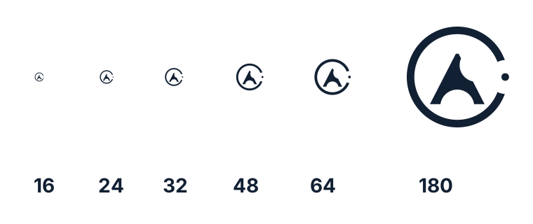
The labels refer to the exported icon sizes; the illustration scales with the page.
For Apple touch icons and web app icons, the two-colour symbol sits on a solid white background with space around the mark. That margin helps keep the letters and dot visible when the system applies an icon mask.
How it appears across the site
The desktop and mobile headers use the monogram. The footer displays the complete logo, horizontally centred. The favicon uses the monochrome version; sharing previews show the complete name in white and turquoise on navy.
This choice follows the same attention to consistency I described in the ACDesign post: a recognisable foundation, adapted to its available space and surface. In the new logo, sizes and colours change while the relationship between A, C and the dot stays the same.